Kelwin Wong
Architect & Graphic Designer
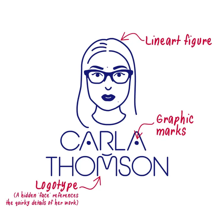

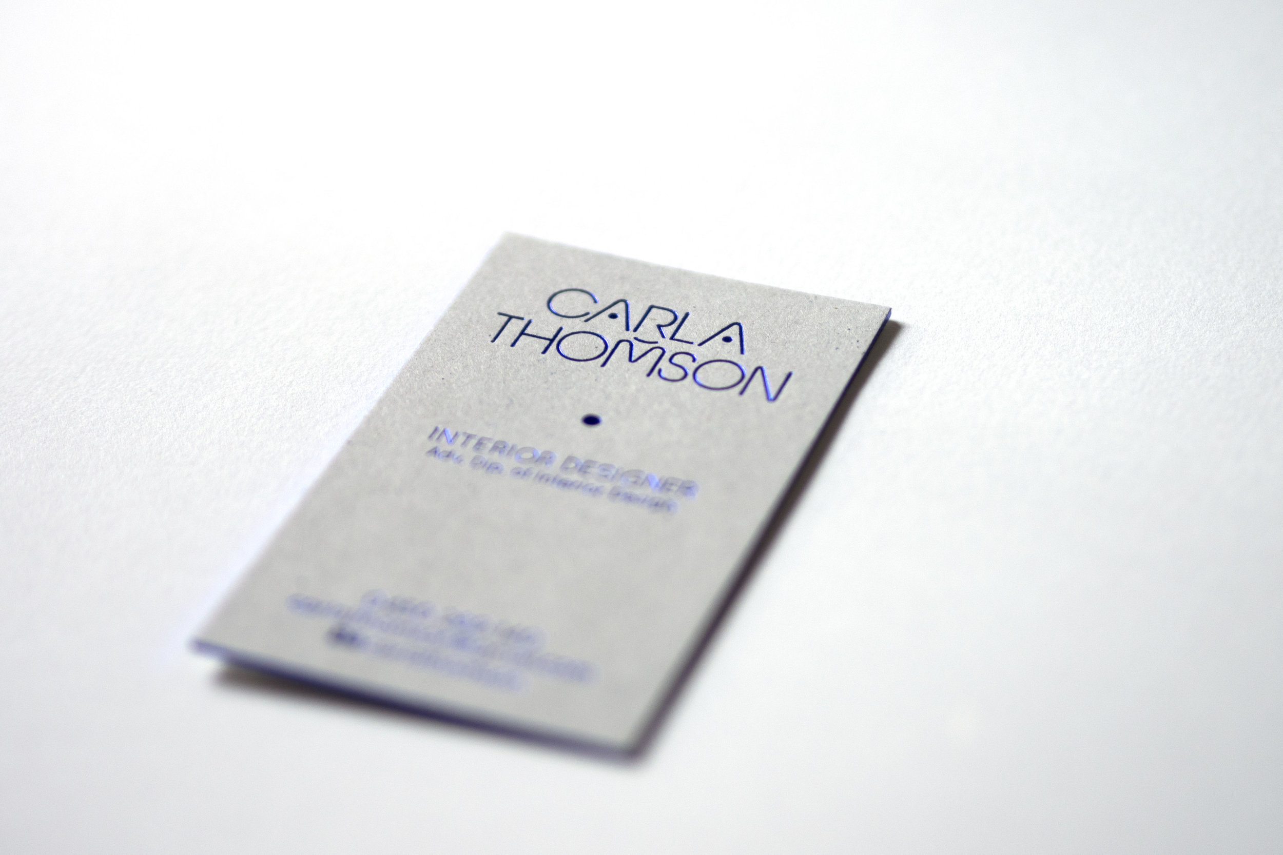

Interior Designer Carla Thomson wanted a brand that would reflect her personality, and her design approach which is detailed oriented and rich in narrative. Carla had a clear vision of a line portrait to represent her branding using a specific blue (which we named 'Carla Blue'). A brand system based on her facial beauty marks creates a scalable icon system to showcase her work and a custom typeface embedding a hidden face in the logotype reflects the quirky details often found in Carla's work.