Kelwin Wong
Architect & Graphic Designer
Selected works
Below are a couple of examples I have done to help my clients tell their stories with visually impactful graphics. The complexity and style were aligned to the client’s brief and requirements. I have provided a bit more context under each project’s feature.
Best wishes,
Kelwin
Corporate Communications (General)
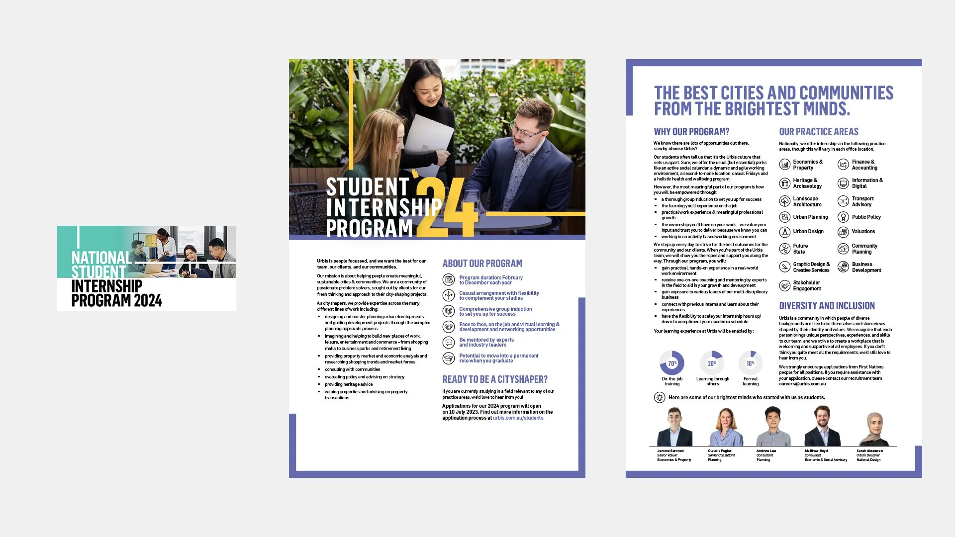
Client: Urbis
I produce a wide range of internal communication pieces for Urbis including posters, social media tiles, intranet graphics, TV screens and slide decks. The requests can be quite broad from a range of different stakeholders, but generally will be aligned to a keystone campaign for the financial year, or ongoing support to the People & Culture, or Diversity and Inclusion working groups. Part of the collateral produced will be for Word and Powerpoint templates to enable the internal teams to manage the content ongoing.


Generation Clay: Reimagining Asian Heritage - Social and print campaign
Client: City of Casey
This was a suite of graphics to support the Comms team at the City of Casey to promote an art exhibition promoting 14 Asian artists’ ceramics works. The campaign ran over a 6 month period and required a suite of print and digital assets to communicate key messages, activities and dates. I developed the visual identity around the event, and used this as a way to create a recognisable branding that sat alongside the city’s other key promotion events. I also designed and produced the construction drawings for the gallery exhibition space. In addition, I also produced a ‘social media’ toolkit for the marketing team; a series of standalone ‘drag-and-drop’ graphics that the internal communications team could use to produce additional collateral concurrent to the campaign.


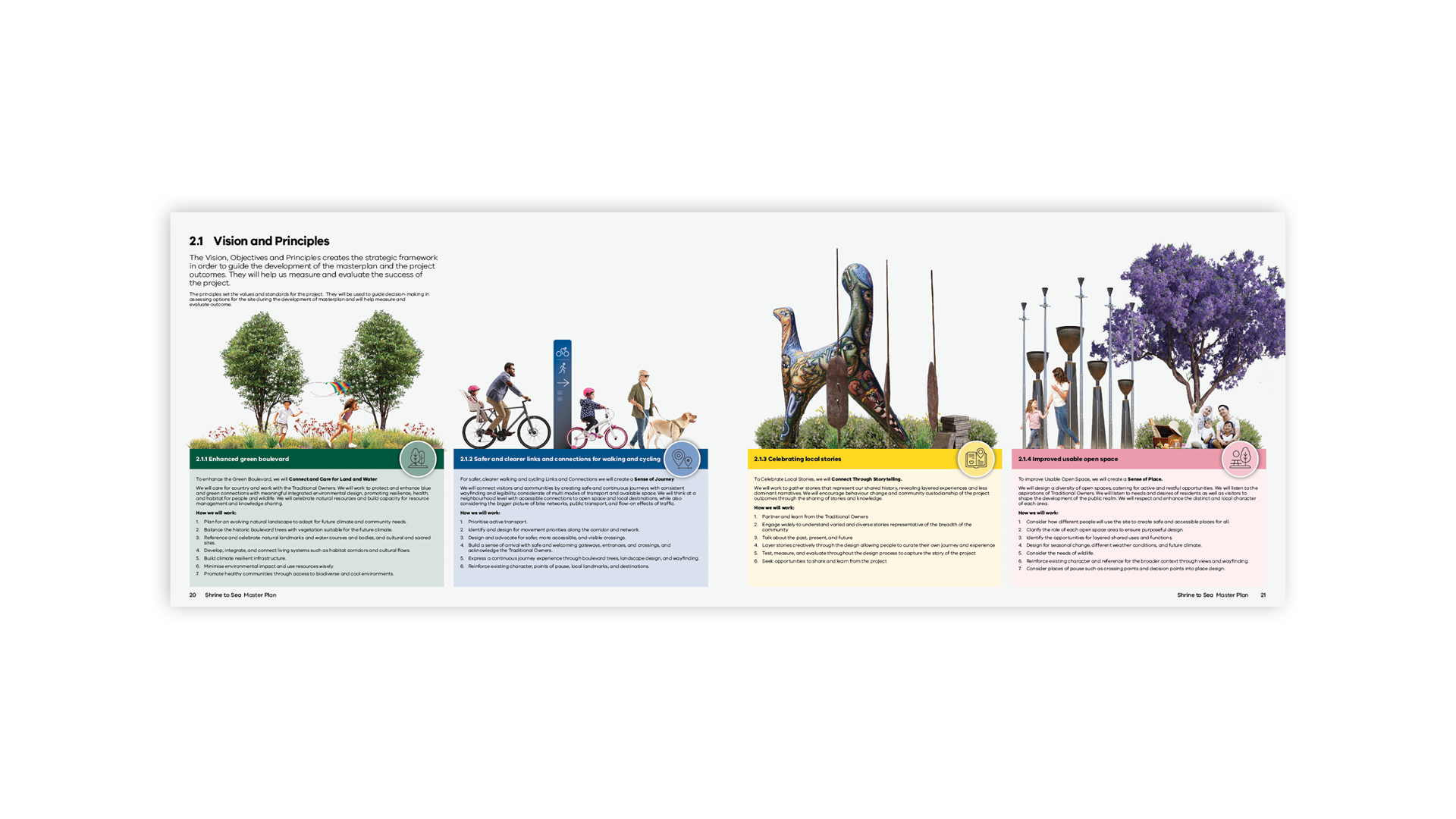
Shrine to Sea Master Plan document - Interim draft
Client: DELWP in collaboration with City of Port Phillip
Below are draft spreads I have been developing in conjunction with DELWP and City of Port Phillip for the Shrine to Sea Master Plan document. My contribution for this project includes attending stakeholder workshops to ideate and identify options for visually engaging layouts for a broad readership.


Guide for Establishing and Managing Night Time Economy Uses.
Client: NSW Government.
An example of producing creative collateral that is on-brand was my work for ‘Guide For Establishing And Managing Night Time Economy Uses’ for the NSW Government Department of Planning. This was a 44-page PDF guide to describe the processes for applying for necessary approvals to establish or expand an existing business within the night time economy space. Working to an established NSW government branding, I was able to express the brand in a new manner through the use of a ‘neon’ colour palette, illustration style and strategic choice of imagery. The document was well received and is currently in use on the department’s website and can be viewed at the following link.


Various Community Engagement collateral
Client: Urbis, Woolworths, Blantyre Farm and Marist Catholic College.
Through my employment at Urbis, I am engaged to produce community engagement collateral such as flyers and letter drops for a variety of different clients. This requires me to produce engaging and easy to understand materials which are aligned to the external clients’ brand guidelines.


Wayfinding & environmental graphics
Client: Town of Beverley, DevelopmentWA & Herston Quarter
I have experience designing large-scale environmental graphics and signage, such as freestanding structures and displays, as well as heritage interpretation panels. This includes design workshops with multiple stakeholder groups to captures and interpret project requirements into graphical visuals, and advise them on the appropriate material finishes. I can also work closely with the manufacturer or large-scale printers to prepare the artwork in accordance with their specifications.


Perth Airport Opportunities Paper
Client: Brookfield.
The Brookfield land use opportunity paper for the Perth Airport is a document that uses a mix of high-impact imagery, infographics, maps and aerial photography with overlay graphics to communicate the proposed mixed uses and precincts within the Perth Airport locality.


Data Visualisation
Below are examples I have produced for long form reports. Often the data is derived from datasets such as excel spreadsheets, or higher level insights provided by my clients.


Below are examples where data visualisation have been more creatively or visually integrated into the document layouts.


Video and motion graphics
The following are select projects for video and motion graphics.
Orchard Road Human Movement Data
This was a short form video produced for social media to show the impacts of Covid on visitation rates to Orchard Road in Singapore. This was a collaboration with a GIS specialist who produced standalone human movement intensity maps. I then overlaid these maps into a 3D flythrough with a timeline graphic.
Department of Transport WA
This is a short animated video produced to discuss the Armadale Train Line closure in Western Australia. This video was produced as a high-level communication piece for a broad stakeholder group, and uses a mix of clean line illustrations and aerials. Two variants of the video were produced; one used for the press conference (leftside video); and a short-form video to be used by media outlets (rightside video).